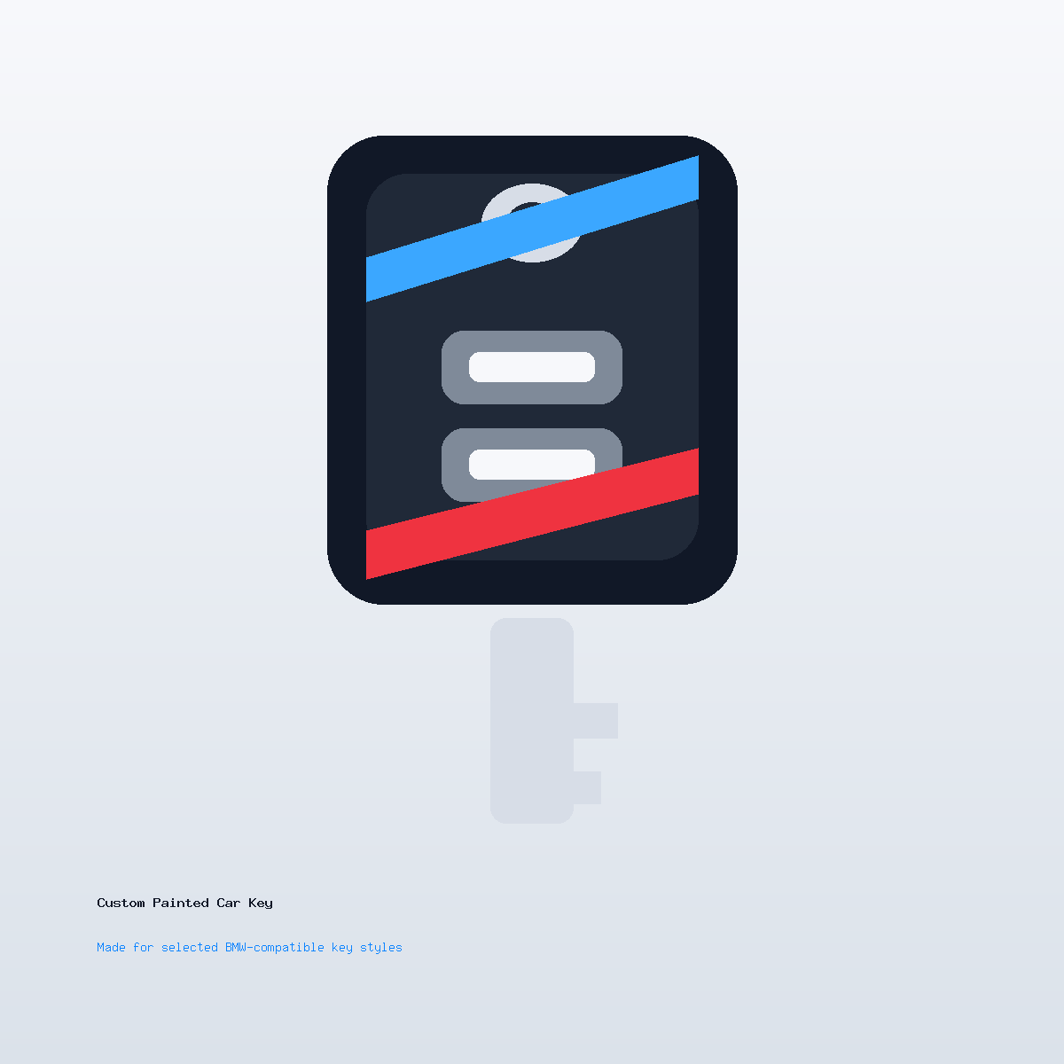
Custom Car Key Guides
Custom Car Key Ideas for Luxury Inspired Style
Jun
A luxury-inspired custom car key does not need fake badges, oversized metallic effects, or loud decoration. In fact, those choices often make a small object feel cheaper. A premium-looking key shell usually comes from restraint: controlled color, clean edges, subtle contrast, and details that feel placed rather than pasted on.
The goal is not to imitate a manufacturer product. The goal is to make the key you carry feel more intentional, polished, and connected to the way you use the car.
Use A Calm Color Palette
Premium style often starts with quiet color. Graphite, satin black, warm silver, pearl white, deep navy, and dark green can all feel elevated when the finish is clean. These colors do not need much help. The surface and proportion do most of the work.
If you like lighter finishes, read the satin silver ideas. Silver can feel refined when it is restrained, but it can become busy if paired with too many bright details.
Let One Detail Carry The Design
A luxury-inspired key should not have too many competing details. One contrast line, one small mark, one back-side initial, or one subtle side accent is usually enough. The key is small. If every surface has a design job, none of them feel premium.
Think of the finish like a watch dial or a clean wallet. The best details are precise, not numerous.
Avoid Fake Luxury Signals
Do not rely on fake emblems, overdone gold effects, crowded monograms, or copied brand cues. Those choices can make a custom shell feel less credible. A premium look comes from the quality of the decision, not from pretending to be something official.
If you want initials or a tiny mark, keep it independent and understated. The artwork notes can help set expectations for a small surface.
Match The Interior More Than The Exterior
Exterior color can inspire a key, but interior details often create a better luxury direction. Seat stitching, trim color, black leather, brushed metal, wood tone, or dark cabin accents can translate into a calmer key design.
A key carried in everyday life often sits closer to a wallet or watch than to the car body. Designing around interior mood can make the shell feel more natural.
Choose Finish Texture For The Carry Routine
Gloss can look polished in photos, but it may show fingerprints. Satin can look quieter and may feel better for daily use. Metallic finishes can feel premium when subtle, but heavy metallic effects can look busy on a small shell.
If the key will be carried with other objects, choose a finish that still looks good after normal handling. A luxury-inspired object should not become stressful to use.
Write A Premium-Style Note
A useful note might say: “Graphite satin finish, tiny silver initials on the back, no front artwork, refined daily-carry look.” Another might say: “Pearl white shell, dark side edge, very minimal.” The clearer the restraint, the easier the review.
When ready, review the Custom Painted Car Key product page. If exact finish tone or artwork placement matters, use contact support before checkout.
Luxury Custom Car Key Questions
What makes a custom key look premium?
Calm colors, clean finish texture, restrained contrast, and small precise details usually feel more premium than loud graphics.
Should I use gold?
Gold can be risky on a small object. A subtle warm accent may work, but heavy gold effects often look less refined.
Can a luxury-inspired key include initials?
Yes, but the initials should be small and carefully placed, often on the back or lower area.
Does premium style mean official manufacturer branding?
No. A premium custom finish should stay independent and avoid pretending to be a manufacturer accessory.