Custom Car Key Guides
What Artwork Notes to Send for a Painted Car Key
Jun
Artwork notes for a painted car key should be shorter than most buyers expect. The key shell is small. The surface is interrupted by buttons, seams, curves, and areas that get touched every day. A long design paragraph can sound creative while making the actual order harder to review.
The best notes do not try to describe every possible visual detail. They tell the reviewer what matters most, what can be simplified, and what should be avoided. That is the difference between a custom idea and an unclear instruction.
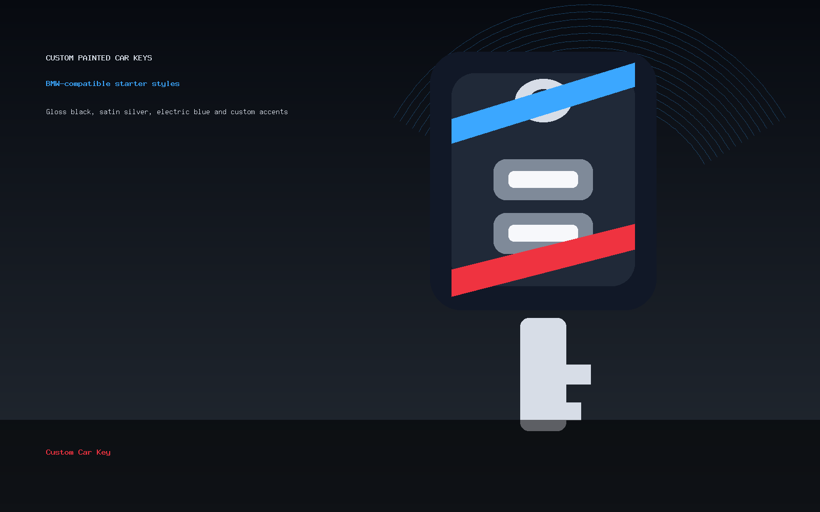
Name The Finish First
Start with the finish because it sets the whole design. Gloss black, satin silver, deep blue, pearl white, matte-inspired dark gray, or a restrained two-tone direction all create different expectations. If the finish is not named, the rest of the note floats.
After the finish, name one accent if you want one. One accent is usually enough. Red side line. Blue edge. Silver button-area border. Small initials on the back. When the note has three accents, two text ideas, and a reference image, the key starts to become visually crowded before production even begins.
Say What The Reference Image Is For
A reference image can mean many things. It might show color, mood, line thickness, contrast, layout, shine, or something else entirely. If you send an image, write one sentence explaining why it is there.
For example: “Use this image only for the dark red color direction, not the logo.” Or: “I like the satin finish and the small side stripe, but I do not need the exact pattern.” That kind of note prevents the reference from becoming a guessing game.
Keep Text And Initials Modest
Text is where many custom key ideas get too ambitious. A key shell does not have the room of a phone case. Initials can work. A short name might work in the right placement. A slogan, detailed mark, or tiny paragraph will usually feel forced.
If you want initials, say whether they should be subtle or clearly visible. If you want a name, keep it short. If the lettering must be exact, ask first, because small curved surfaces may require simplification.
Describe Placement In Plain Language
You do not need professional design vocabulary. Plain placement notes are better. “Small initials on the back lower area.” “Accent line along the side edge.” “Keep the button area clean.” “No paint over button symbols.” These instructions are practical because they connect the design to the object.
If you are not sure where something should go, say that. A note like “place the accent where it looks clean and does not crowd the buttons” is more useful than forcing a placement that may not suit the shell.
Tell Support What Not To Do
Good artwork notes include limits. If you do not want logos, say no logos. If you want a subtle finish, say not too bright. If you dislike heavy contrast, say that. Negative instructions can be helpful when they are specific.
Do not use the notes to request protected vehicle-brand marks or imply manufacturer approval. Compatibility wording is descriptive only. The safer design language is about color, finish, placement, initials, and personal style.
A Good Artwork Note Example
Here is a strong note: “Satin black base, dark blue side accent, no logo, no large artwork. If initials fit cleanly, add small J.M. on the back; if not, leave initials off. Keep the button area clean.” It gives a hierarchy. The finish matters most. The accent matters second. The initials are optional. The button area is protected.
Here is a weaker note: “Make it look like the attached pictures and add my initials somewhere.” That leaves too much open. Which picture matters? Which color? Which placement? Should the initials be bold or subtle? A custom key order should not need that much guessing.
If you already know your design direction, move to the Custom Painted Car Key product page. If you want help making the note clearer, send a message through contact support. For the full order flow, read how to order a custom painted car key online.
Painted Car Key Artwork Notes Questions
How long should my artwork note be?
Usually two to four short sentences are enough. Name the finish, accent, text or initials if any, and anything that should be avoided.
Can I send a reference image?
Yes, but explain what the reference is for. Say whether it shows color, finish, layout, mood, or only one detail.
What if my idea is complicated?
Ask before ordering. Complex artwork often needs simplification to work on a small key shell, especially near buttons and curved areas.
Should I request exact logos or protected brand marks?
No. Keep the design focused on color, finish, placement, initials, and personal styling. Compatibility language does not mean brand authorization.