Custom Car Key Guides
Custom Key Shell Ideas for Sporty Car Builds
Jun
A sporty custom key shell should feel connected to the car without trying to become a miniature race livery. The key is small, handled often, and full of functional details. A good sporty finish uses color, contrast, and placement with control.
The best result often comes from choosing one build cue and translating it onto the key: a brake accent, stitching color, wheel finish, exterior stripe, or black-and-red contrast. The key should look like it belongs to the car, not like it is wearing every idea at once.
Pick One Sport Cue
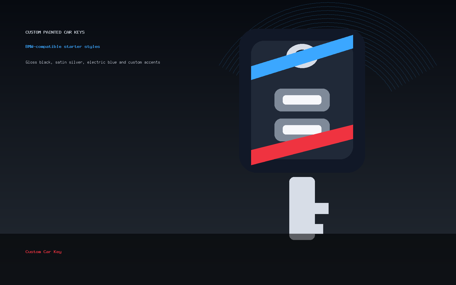
Start by choosing one reference from the car. It could be red calipers, blue stitching, black wheels, carbon-look trim, a silver body line, or a bright exterior accent. Do not try to include all of them. One cue gives the design focus.
If the car already has a strong visual identity, the key can echo it lightly. A small red accent may be enough for a car with red brake details. A blue edge may be enough for a build with blue interior stitching.
Use Black As A Useful Base
Black is popular for sporty key shells because it gives accents room to work. Gloss black feels sharp. Satin black feels more controlled. A black base with one red, blue, silver, or white detail can look sporty without becoming loud.
For a focused version of this direction, compare gloss black ideas and red accent designs. Those pages show why small contrast choices can do more than a full-color shell.
Keep Lines Simple
Sporty does not have to mean complicated. A diagonal stripe, side edge, lower band, or small corner accent can be enough. The line should follow the shell shape rather than fight it. If the shell curves, let the accent respect that curve.
Hard angles can work, but they need room. If the button layout is crowded, keep the stripe away from the button icons.
Avoid Fake Performance Branding
The key should not pretend to be an official motorsport accessory or use protected branding. A custom shell can feel sporty through color and composition alone. Clean contrast, good placement, and restraint usually look better than copied badges.
If you want a mark, keep it simple and independent. Read the simple logo-style notes before asking for tiny artwork.
Think About Wear Points
Sporty designs often use bright accents, and bright accents can show edge wear more visibly. Keep high-contrast details away from the most rubbed corners if durability is a concern. A side accent or back detail may age better than a bright front edge that touches everything.
This does not mean you should avoid color. It means the color should be placed where it can still look good after real use.
Write A Sporty Order Note
A good note might say: “Satin black base, red lower stripe, sporty but clean, no logo.” Another might say: “Graphite base, blue side edge, keep button area simple.” These notes are clear enough to guide production review.
Start from the Custom Painted Car Key product page. If your sport cue depends on exact placement, send the idea through contact support before checkout.
Sporty Custom Key Shell Questions
What makes a key shell look sporty?
Controlled contrast, a strong base color, one accent cue from the car, and clean line placement usually create the sporty feel.
Is red always the best accent?
No. Red works for some builds, but blue, silver, white, graphite, or body-color accents can be better depending on the car.
Can I use racing-style artwork?
Keep it simple and independent. Avoid protected branding and crowded graphics on the small key surface.
Should the button area be painted heavily?
Usually no. Sporty accents should not make button icons harder to read or use.