Custom Car Key Guides
Two Tone Car Key Paint Ideas for BMW-Compatible Styles
Jun
Two-tone car key paint can make a small shell feel much more personal, but it needs discipline. Two colors do not mean two equal personalities fighting for space. The strongest two-tone designs usually have one main color and one supporting color. The main color sets the mood. The second color adds the detail.
This is especially important for selected BMW-compatible key styles, where the shell shape, button layout, and side profile can make some color divisions look natural and others look forced.
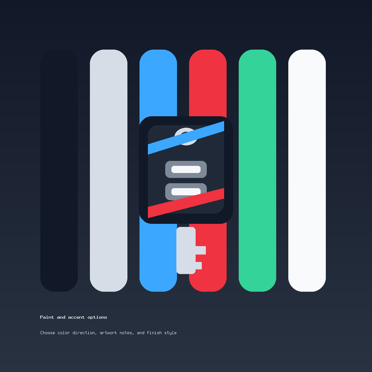
Choose The Lead Color First
The lead color should cover most of the visual surface. It might be gloss black, satin black, graphite, satin silver, deep blue, or another restrained base. This color decides whether the key feels premium, sporty, minimal, gift-ready, or modern.
The second color should have a smaller job. It can define a side edge, a stripe, a lower accent, or a small contrast area. If both colors try to dominate, the shell can feel busy fast.
Good Two-Tone Pairings
Black and red is the obvious sporty pairing, but it works best when red is limited. Black and blue can feel modern and cleaner than red. Graphite and silver can create a quiet premium look. Satin silver and black can feel crisp without being bright.
If the buyer wants a bolder combination, the order note should still name a hierarchy: “black base with blue accent” is clearer than “black and blue.” The word base tells the reviewer which color should lead.
Use The Shell Shape As The Map
The shell itself should guide the color division. Edges, curves, seams, and button zones often suggest where the second color belongs. A two-tone layout that ignores those details may look good in imagination but awkward on the actual key.
If your key has a different button count or unusual side shape, ask before ordering. A two-tone design depends more on placement than a single-color finish. Clear photos make that placement conversation much easier.
What To Avoid
Avoid splitting the key into two loud halves unless the shell shape clearly supports it. Avoid adding a third color too quickly. Avoid placing a strong color around every button, seam, and edge at the same time. The more divided the surface becomes, the less custom and more cluttered it can feel.
Also avoid language that suggests an official manufacturer trim or brand package. Compatibility wording on this site is descriptive only. A two-tone finish can be inspired by a car’s mood, but it is still an independent custom painted shell offer.
How To Write A Two-Tone Order Note
A strong note might say: “Gloss black base, narrow red side accent, sporty but clean.” Another might say: “Satin silver base with small black lower detail, minimal and gift-ready.” These notes make the hierarchy clear.
A weak note says: “Make it two tone.” That leaves too many decisions open: which color is dominant, where should the second color go, how bold should it feel, and should the button area stay clean?
Before You Choose Two Tone
Review the actual shell style first. For selected BMW-compatible styles, compare the button layout, outline, back, side profile, and ring or blade area. If any of those details are uncertain, send photos through contact support before checkout.
When the design direction is ready, use the Custom Painted Car Key product page. For broader compatibility language, read BMW-compatible key style notes. For more design direction, start with the custom painted car key ideas guide.
Two-Tone Car Key Paint Questions
How many colors should a two-tone key use?
Usually two is enough. One should be the base color and the other should act as the accent or supporting color.
What is the safest two-tone layout?
A dark base with one side or lower accent is often safer than splitting the whole key into two equal bright sections.
Can I choose two bright colors?
You can ask, but it may not be the cleanest result. Bright colors need more restraint on a small shell.
Why does shell compatibility matter for two-tone paint?
Color placement depends on buttons, curves, seams, and edges. If the shell shape is uncertain, the two-tone layout is uncertain too.