Custom Car Key Guides
Custom Painted Car Key Ideas for a Cleaner Everyday Carry
Jun
A custom painted car key is a tiny object, which is exactly why it deserves more restraint than people expect. On a phone case or a laptop skin, you can get away with a loud illustration. On a key shell that lives in a pocket, sits beside a watch, lands on a desk, and gets handled several times a day, the best ideas usually feel edited.
The goal is not to make the key scream for attention. The goal is to make it look intentional when you notice it. That can mean a glossy black shell with a narrow red line, a satin silver face with a dark side edge, a deep blue accent around the button area, or a tiny set of initials placed where they do not fight the shape of the shell.
Start With The Mood, Not The Color
Most buyers start with color because color is easy to name. Black, red, blue, silver, white. The better starting point is the mood. Do you want the key to feel cleaner than the stock shell, sportier than the interior, more personal as a gift, or more premium when it sits next to your wallet and watch?
Once the mood is clear, the color choice becomes calmer. A subtle everyday key might use satin black, gunmetal, warm silver, or a very dark green. A sportier key might use gloss black with one red or blue accent instead of turning the entire shell into a bright object. A gift key might use the recipient’s car color as the reference, then soften it so the key still feels usable after the surprise is over.
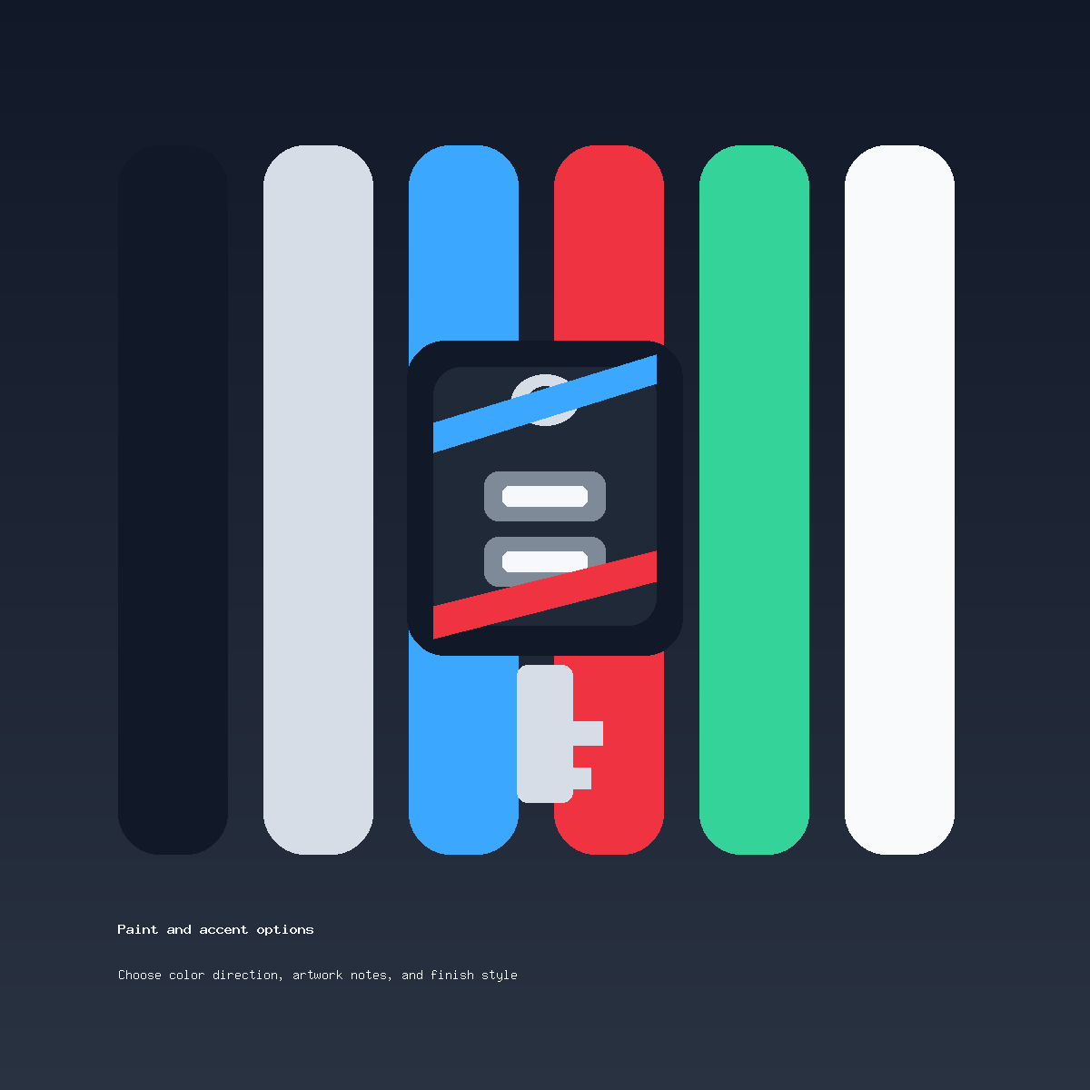
Four Directions That Usually Work
The first reliable direction is the clean single-color finish. This is the safest choice for daily carry because it changes the feel of the key without asking every detail to compete. Satin black, graphite, pearl white, and silver all work here. The finish matters as much as the hue: gloss feels sharper, satin feels quieter, and a soft metallic finish can make the key feel more finished without looking flashy.
The second direction is a two-tone shell. This works best when one color owns the main surface and the other color is used as a border, stripe, side edge, or small button-area accent. The mistake is splitting the key into two equal loud halves. A better two-tone design uses one dominant color and one supporting color.
The third direction is a small personal mark. Initials, a short name, or a tiny symbol can work, but only if the buyer accepts that small artwork must be simplified. Thin lettering, detailed emblems, and tiny gradients often look better in a mockup than they do on a real key shell. If the mark needs explanation, it may be too complex for this surface.
The fourth direction is a car-inspired accent. This can reference the interior stitching, brake caliper color, wheel finish, or a body color. It should be a nod, not a costume. The key does not need to copy the car exactly to feel connected to it.
What To Avoid On A Small Shell
A key shell has buttons, curves, seams, corners, and areas that get touched constantly. Designs that ignore those realities tend to feel busy quickly. Avoid stacking a full color change, a large graphic, initials, stripes, and multiple accent colors in one order. Pick the one thing that matters most.
Also be careful with exact color matching. Screens, lighting, car paint reflections, and the finish material can all shift the way a color appears. If the design depends on a perfect match to a vehicle color, ask first and be ready for a close visual direction rather than an exact factory paint promise.
A Simple Way To Choose
If you are stuck, write one sentence instead of building a mood board. For example: “I want a clean black key with one red accent, sporty but not loud.” Or: “I want a satin silver finish that feels close to a factory-clean accessory.” That kind of sentence gives the order a spine. It tells the reviewer what to protect and what to ignore.
Then check the practical side. Is your key shape one of the selected compatible key fob styles currently supported? Do the button layout and shell outline look close enough? If you are not sure, send photos before ordering. Compatibility language on this site is descriptive only; Custom Car Key is an independent painted shell offer, not a vehicle manufacturer product or replacement-key service.
Good Notes Make Better Keys
The best order notes are short and visual. Name the base color, the finish feel, the accent color if any, and where the accent should sit. Mention anything that should stay simple. If you want initials, say whether they should be subtle or visible at a glance. If the key is a gift, say that too, because gift designs often benefit from a more timeless finish.
When the idea is ready, use the Custom Painted Car Key product page to review the current offer. If the key shape, timing, or design is uncertain, send a message through contact support before checkout. A careful question before production is much better than a complicated change after the order is already moving.
Questions About Custom Painted Car Key Ideas
Should I choose a bold color or a subtle finish?
Choose the finish that matches how you carry the key. If it sits with a watch, wallet, or work bag, subtle often ages better. If the car itself has a strong color accent, one controlled bright detail can work well.
Can I request initials or a small mark?
Yes, but keep the mark simple. Small shells do not reward complicated artwork. A short initial placement is usually cleaner than a detailed logo-style request.
Do I need to send a photo of my key?
If there is any doubt about the shell shape or button layout, yes. A photo helps support review the selected compatible style before you focus on paint.
Is this an official vehicle-brand accessory?
No. Custom Car Key is an independent custom painted key shell offer. Compatibility wording is descriptive and does not mean manufacturer affiliation, endorsement, or original factory status.