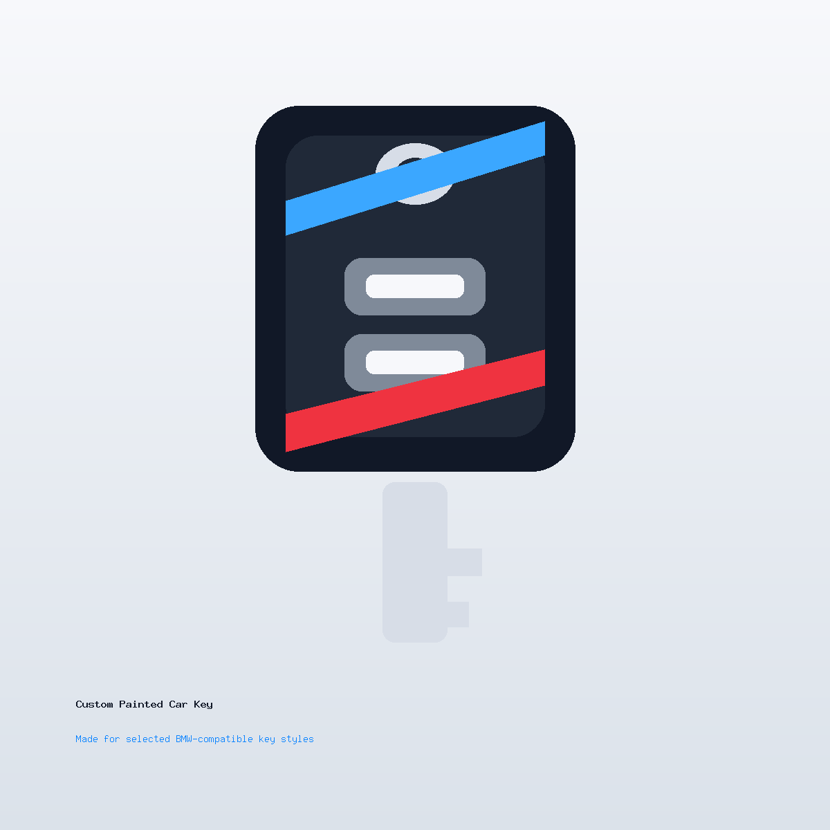
Custom Car Key Guides
Custom Key Shell Ideas for Minimalists
Jun
A minimalist custom key shell is not the absence of design. It is design with fewer decisions showing. On a small daily-carry object, that restraint matters. The key sits in a hand, pocket, tray, desk, or bag all day. A minimalist finish should look intentional without asking for attention every time it appears.
The best minimalist designs usually come from editing: one main color, one texture direction, one small contrast point, and no decoration that makes the buttons harder to read.
Start With A Single Strong Base Color
Minimalist key shells work well in satin black, graphite, soft silver, pearl white, deep navy, or a muted green. These colors give the key a finished look without making the object loud. A single-color finish can be enough if the surface and edges are clean.
If you are not sure where to begin, read the gloss black finish ideas and the satin silver ideas. Both directions can become minimalist when the accent work stays controlled.
Use Contrast As A Detail, Not A Theme
A minimalist design can still have contrast. The difference is scale. A thin side edge, a tiny lower mark, a small back detail, or a muted button-area frame can make the key feel custom without turning it into a graphic object.
One contrast detail is usually enough. When the key has a colored edge, initials, a line, and a separate button accent, the design stops feeling minimal.
Keep The Button Area Quiet
Buttons already create visual structure. A minimalist key shell should let them remain readable. Avoid crowded artwork around icons or heavy color blocks that make the controls look like part of the decoration.
If the shell has a strong button layout, the cleanest choice may be to leave the button field simple and move the custom detail to the side or back.
Choose Finish Texture Carefully
Gloss can feel sharp and modern, but it may show fingerprints and fine marks more clearly under bright light. Satin can feel calmer and more forgiving. Metallic finishes can look premium, but they should be restrained so the key does not become visually busy.
Minimalist style is often less about color and more about finish discipline. A quiet graphite finish can feel more custom than a complicated three-color layout.
Small Personalization Can Work
Initials, a date, or a small mark can fit a minimalist direction if the placement is careful. Keep it small. Keep it away from crowded buttons. Let it feel discovered rather than announced.
For placement limits, read the painted key artwork notes. If the mark needs to be exact, ask support before checkout.
Order Notes For A Minimal Finish
A strong note for this style sounds simple: “Satin black, no logo, tiny silver mark on the back, clean daily-carry look.” Or: “Graphite base, no text, subtle blue side edge.” The note should describe what to leave out as clearly as what to include.
When the direction is clear, review the Custom Painted Car Key product page. If you want a very specific mark or subtle color, use contact support before checkout.
Minimalist Custom Key Shell Questions
What makes a custom key shell minimalist?
A restrained color palette, clean finish, quiet button area, and one small personal detail usually create the minimalist feel.
Which colors work best?
Satin black, graphite, silver, pearl white, deep navy, and muted green are strong starting points.
Can minimalist designs include initials?
Yes, if the initials are small and placed away from crowded button areas.
Should I choose gloss or satin?
Gloss feels sharper, while satin often feels calmer and easier for daily carry. The better choice depends on how you use the key.