Custom Car Key Guides
Contrast Stripe Ideas for Painted Key Shells
Jun
A contrast stripe is one of the cleanest ways to make a painted key shell feel custom. It gives the key motion, direction, and personality without requiring a complicated graphic. But stripe placement has to respect the key’s actual shape. A stripe that looks great on a flat rectangle can become awkward once it crosses buttons, curves, and edges.
The safest stripe ideas are simple enough to describe in one sentence. A narrow side stripe. A lower back stripe. A diagonal accent that avoids the button field. A small color line that ties to a car detail. If the description takes a paragraph, the stripe may already be too complicated.
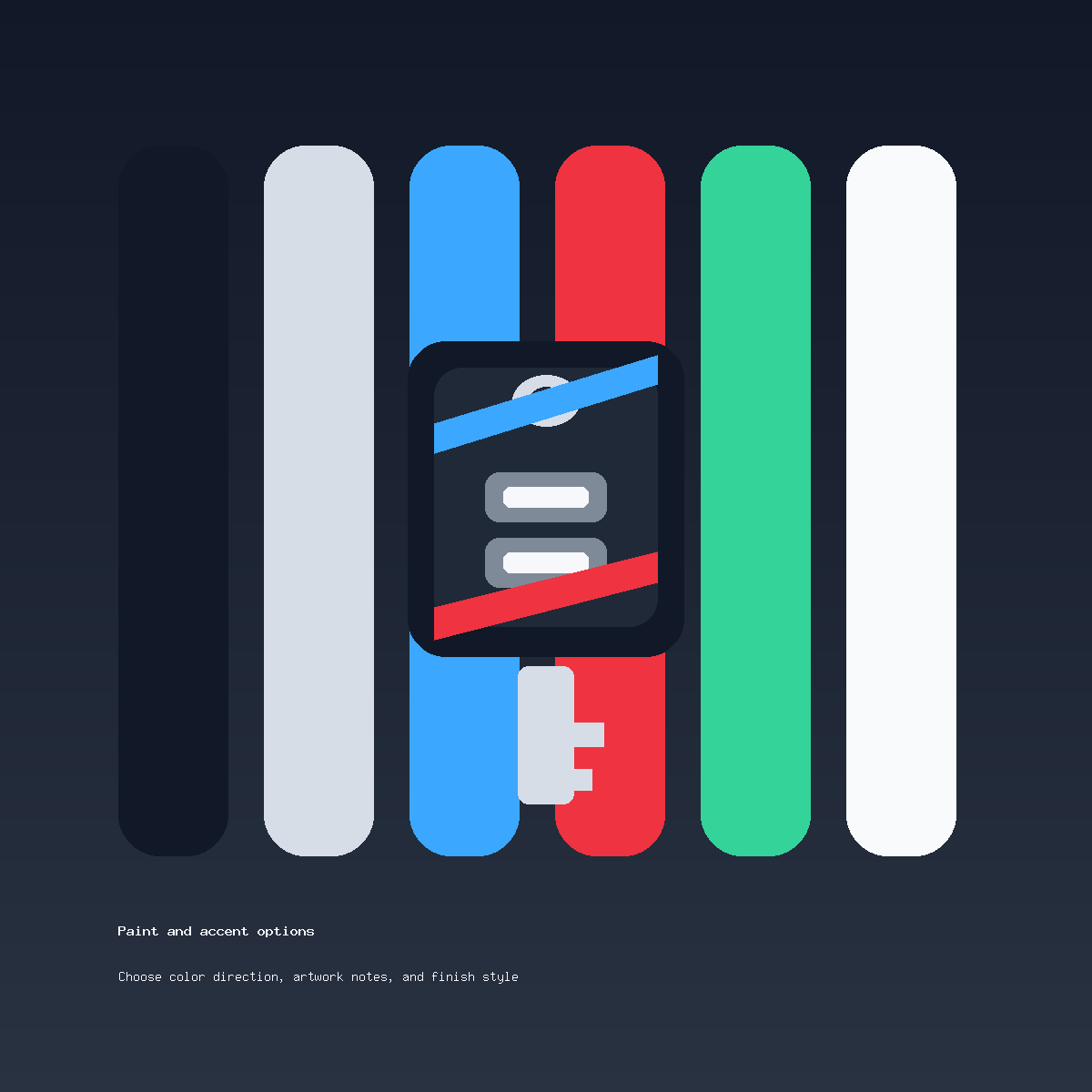
Horizontal Stripes Feel Calm
A horizontal stripe can make the key feel longer and more stable. It works well on the back or along a side area where it does not interrupt buttons. Horizontal lines are good for monochrome, black-red, black-silver, and understated sport designs.
For buyers who want a sportier result, a narrow red horizontal detail can be enough. The red accent design guide has useful examples of keeping red controlled.
Vertical Stripes Feel Technical
A vertical stripe can make the key feel slimmer and more deliberate. It is best when the shell has a clean central area or side plane. On some key shapes, buttons make the front too busy for a vertical stripe, so the stripe may belong on the back instead.
Vertical stripes also work well in dark palettes. Black and graphite, silver and charcoal, or navy and black can create a subtle technical look without adding a bright color.
Diagonal Stripes Need More Caution
Diagonal stripes bring energy, but they can fight the key shape if the angle crosses awkward areas. A diagonal line should usually avoid the main button area and stay narrow. It can look especially good as a lower-corner accent or back-shell detail.
If the diagonal stripe is tied to a vehicle livery, simplify it. A full livery layout rarely fits a key, but one diagonal cue can carry the idea.
Write Stripe Notes Clearly
A useful note names the base color, stripe color, stripe direction, and whether the stripe should be bold or subtle. For example: “Gloss black base, thin red side stripe, subtle.” Or: “Satin silver base, dark diagonal stripe on back only.”
Review the cosmetic painted shell offer on the product page. If you want a stripe checked against your real shell shape, send photos through contact support. This is not programming, cutting, electronics repair, or lost-key replacement. For fit questions, the compatibility notes can help before design choices are finalized.
Painted Key Stripe FAQ
Which stripe direction is safest?
A narrow side or back stripe is usually safest because it avoids the button area and keeps the front clean.
Can a stripe cross the buttons?
It may not be the best choice. Buttons interrupt the surface and can make a stripe look crowded or confusing.
Should the stripe be bright?
Only if the rest of the key is controlled. Bright stripes work best on black, graphite, or other calm base colors.
Can I request a racing-style stripe?
You can request a simplified racing-inspired stripe, but a full race livery usually needs to be reduced for a small key shell.