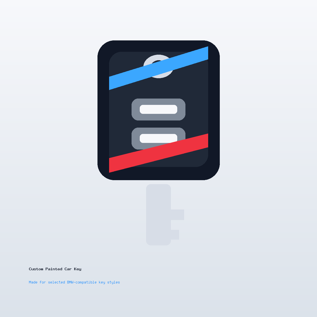
Custom Car Key Guides
Why Tiny Text May Need to Be Simplified on a Key Shell
Jun
Tiny text can look sharp on a screen and still be wrong for a key shell. A key is small, curved, handled often, and viewed from changing angles. When the design includes a long name, slogan, date, or fine lettering, simplification usually creates a better finished piece.
Small Surfaces Punish Fine Detail
On a flat monitor, thin letters look clean because they are backlit and enlarged. On a painted shell, the same letters must survive scale, curvature, paint edges, clear coat, highlights, and daily handling. Fine strokes can close up or lose contrast.
When designing a custom painted key shell, treat text as a visual mark, not a document. The goal is recognition at normal viewing distance.
Initials Often Work Better Than Full Words
Two or three initials can feel intentional and premium. A full phrase can feel cramped. If the key is a gift, initials, a short monogram, or a single meaningful symbol usually looks more polished than a sentence.
If you need help deciding what to simplify, our artwork preparation notes explain why clean shapes beat dense artwork on small parts.
Contrast Matters as Much as Size
Dark text on a dark finish may disappear. Metallic lettering on a reflective surface may look different depending on angle. A simple high-contrast mark is easier to read than thin letters in a subtle tone-on-tone pairing.
Support can help review whether your requested text has enough contrast. Send the idea through support before assuming the same layout will work on every finish.
What Simplification Can Look Like
A full name can become initials. A phrase can become one word. A detailed club logo can become a simplified outline. A date can move to a separate keychain while the shell keeps the visual identity clean.
Simplification is not a downgrade. On a key shell, it often makes the final result look more deliberate and more expensive.
The Custom Boundary Is Cosmetic
This service customizes the painted shell appearance. It does not include programming, blade cutting, electronics repair, lost-key replacement, or changing the internal key functions. Text and artwork choices are part of the cosmetic design only.
FAQ
Why can tiny text look worse on a key shell than on screen?
The shell is small, curved, reflective, and handled often. Fine text can lose clarity after scaling and finishing.
What text length works best?
Initials, short names, or one strong word usually work better than long phrases or small paragraphs.
Can support simplify my logo idea?
Support can review the concept and suggest a simpler direction, but the final design depends on the shell area and finish.
Does adding text affect programming or key function?
No. Text is cosmetic only. The service does not include programming, blade cutting, electronics repair, or lost-key replacement.