Custom Car Key Guides
Initials on a Custom Car Key What Looks Best
Jun
Initials on a custom car key can be a nice personal detail, but they need restraint. A key shell is small, curved, handled often, and broken up by buttons, seams, and edges. The initials should feel like they belong to the object, not like text forced onto a surface that did not have room for it.
The best initials usually do less. Two or three letters. A small placement. A finish that supports the letters instead of fighting them. If the key already has a strong color accent, the initials may need to be even quieter.
Choose The Role Of The Initials
Before choosing placement, decide what the initials are supposed to do. Are they a subtle ownership mark? A gift detail? A visible design element? A monogram-style accent? Those are different jobs. A subtle mark should not be placed like a logo. A gift detail should not become so small that the recipient misses it.
For most custom painted key shells, initials work best as a secondary detail. Let the base finish carry the key. Let the accent, if any, create mood. Then let the initials sit quietly in a clean area.
Good Placements For Initials
The back of the shell is often the safest placement because it keeps the front clean and avoids crowding the buttons. A lower back corner can feel personal without becoming loud. A side placement may work on some shells, but only if the surface gives the letters enough room.
The button area is usually harder. Buttons create visual noise and get touched constantly. If initials sit too close to buttons, they can feel like a functional label rather than a personal mark. When in doubt, keep the button area clean.
Letter Style Matters More Than People Expect
Tiny decorative lettering can disappear or look messy on a small shell. Clean block letters, simple initials with dots, or a compact monogram are usually safer. Thin script may look elegant in a mockup but lose clarity on the actual key.
If you have a specific letter style in mind, explain whether the exact font matters or whether the general mood matters. “Small clean J.M. on the back” is easier to execute than “use this exact script logo from a screenshot.”
Pair Initials With The Right Finish
Initials stand out differently depending on the base finish. On gloss black, a tiny silver or gray mark can feel premium. On satin silver, a dark subtle mark can be clean. On a red or blue accent design, the initials should probably stay neutral so the key does not become too busy.
If the initials are the main personal detail, avoid adding too many other details. A custom key does not need a color accent, initials, a name, a symbol, and a stripe all at once.
How To Write The Initials Note
A strong note is simple: “Satin black base, small J.M. on the back lower area, keep the front clean.” Or: “Gloss black with small silver initials on the back, subtle rather than bold.” These notes give size, placement, color mood, and priority.
If you are flexible, say so. “If initials do not fit cleanly, leave them off” is a useful instruction. It protects the final result from forcing a detail that may not suit the shell.
Before You Add Initials
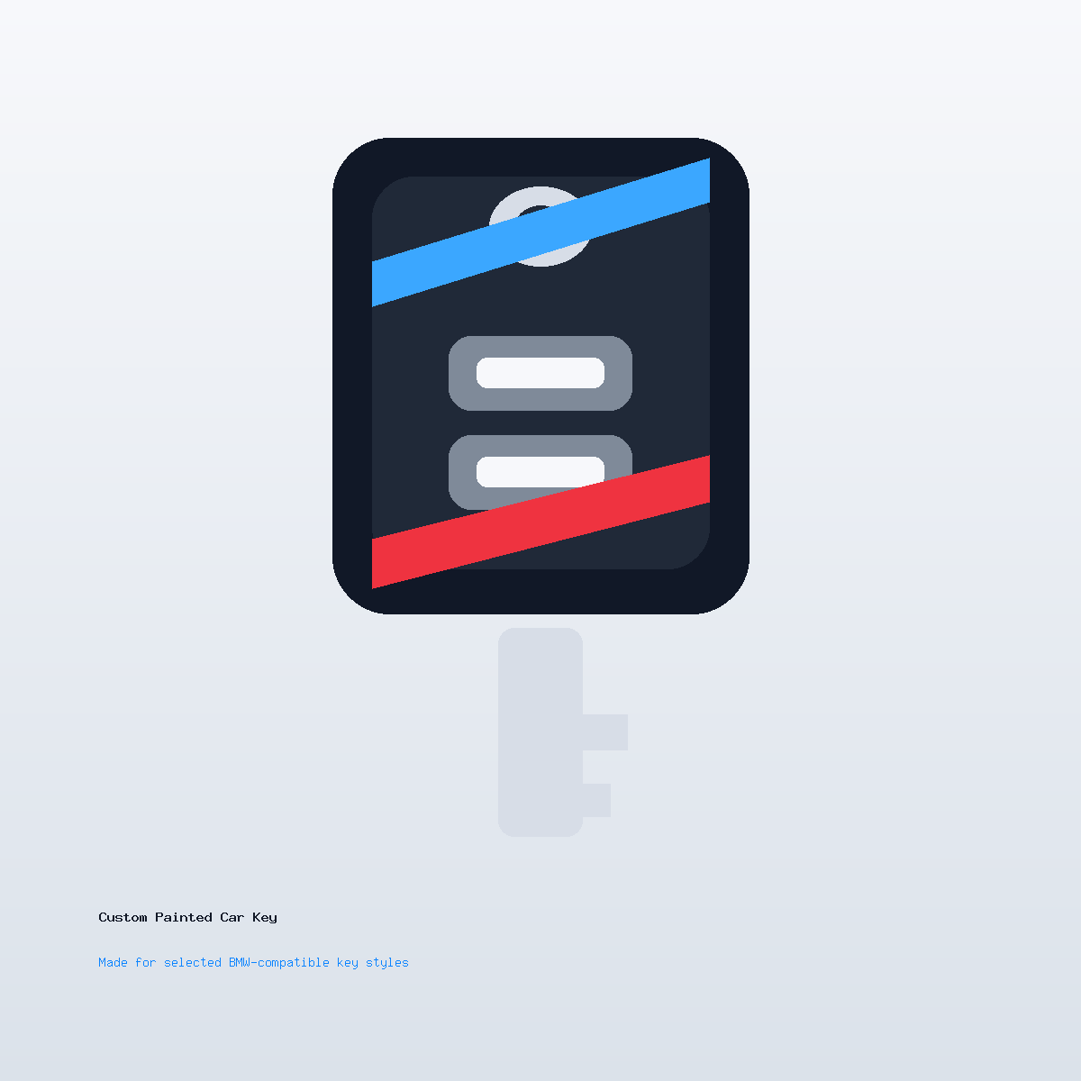
Confirm the shell style before focusing on text. For selected BMW-compatible styles, compare your real key’s button layout, outline, back, and side profile. Compatibility wording is descriptive only and does not mean official, OEM, authorized, or universally compatible.
When you are ready, use the Custom Painted Car Key product page. For broader artwork guidance, read painted car key artwork notes. If placement is uncertain, send photos through contact support before checkout.
Initials On A Custom Car Key Questions
How many letters work best?
Two or three letters usually work best. Longer names or words can feel crowded on a small shell.
Where should initials go?
The back lower area is often safest. It keeps the front clean and avoids the button area.
Can I use a decorative script font?
You can ask, but simple lettering usually stays cleaner at small sizes. If the exact font matters, ask before ordering.
Should initials be bold or subtle?
For most daily-carry keys, subtle is better. The initials should personalize the key without overpowering the finish.