Custom Car Key Guides
Custom Car Key Color Palette Guide
Jun
A custom car key color palette is not just a list of favorite colors. It is a small visual system for an object you touch every day. Because the shell is compact, the palette has to make decisions quickly: one main color, one supporting tone, and maybe one accent. Anything more can start to feel accidental.
The easiest way to build a better palette is to connect it to a style direction. Clean daily carry, sport build, luxury interior, monochrome garage, bright accent identity, or gift personalization all ask for different color behavior.
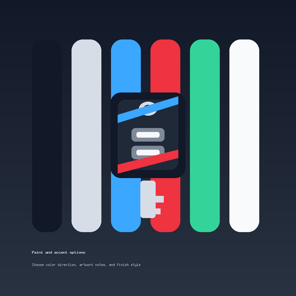
Use A Main Color First
The main color should do most of the work. It covers the mood of the key before any accents appear. Gloss black feels sharp and controlled. Satin silver feels clean and almost factory-like. Deep blue feels modern without being as loud as bright primary blue. Warm gray can feel more premium than plain silver.
If you are unsure, begin with a restrained base and add interest through finish or edge placement. The gloss black key ideas page is a good example of how one quiet base color can still feel custom.
Add One Accent With A Job
An accent should have a job. It might highlight a side edge, frame the button area, echo brake calipers, or make a stripe visible. If the accent is only there because the color is exciting, it may not improve the key.
Red is strong for sporty builds, blue can feel technical, silver can calm a dark shell, and black can reduce a bright palette. One accent is usually enough. Two accents can work only when one is very quiet.
Borrow From Brand Style Without Copying Too Much
If your car already has a visual identity, borrow lightly. Interior stitching, wheel finish, body color, caliper paint, trim texture, or garage style can all guide the palette. The key does not need to duplicate everything. It just needs to look like it belongs in the same world.
For a restrained brand-style palette, choose three words before choosing colors: clean, sporty, elegant, stealth, modern, warm, technical, or minimal. Those words help keep the palette from drifting.
Check Practical Visibility
Some palettes look great in a large render but lose clarity on a small shell. Dark-on-dark combinations can be beautiful but may hide initials or stripes. Bright-on-bright combinations can feel toy-like. Metallic tones can shift under different light.
Before ordering, review the current cosmetic shell styling offer on the product page. If you want to ask whether a palette is too busy, contact support through the contact page. This service is for painted shell styling only, not programming, cutting, electronics repair, or lost-key replacement.
Custom Car Key Color Palette FAQ
How many colors should a custom key use?
One main color and one accent is the safest structure. A third color should only be used if it has a very subtle role.
Should the key match the car paint exactly?
Exact matching is difficult because screens, lighting, and finishes vary. A close visual direction is usually more realistic.
What palette feels most premium?
Restrained palettes usually feel more premium: black and silver, graphite and red, satin silver and charcoal, or deep blue with dark edges.
Can I send a mood board?
Yes, but include a short sentence explaining what to copy from it. Otherwise the reference can be too broad to guide a small key shell.